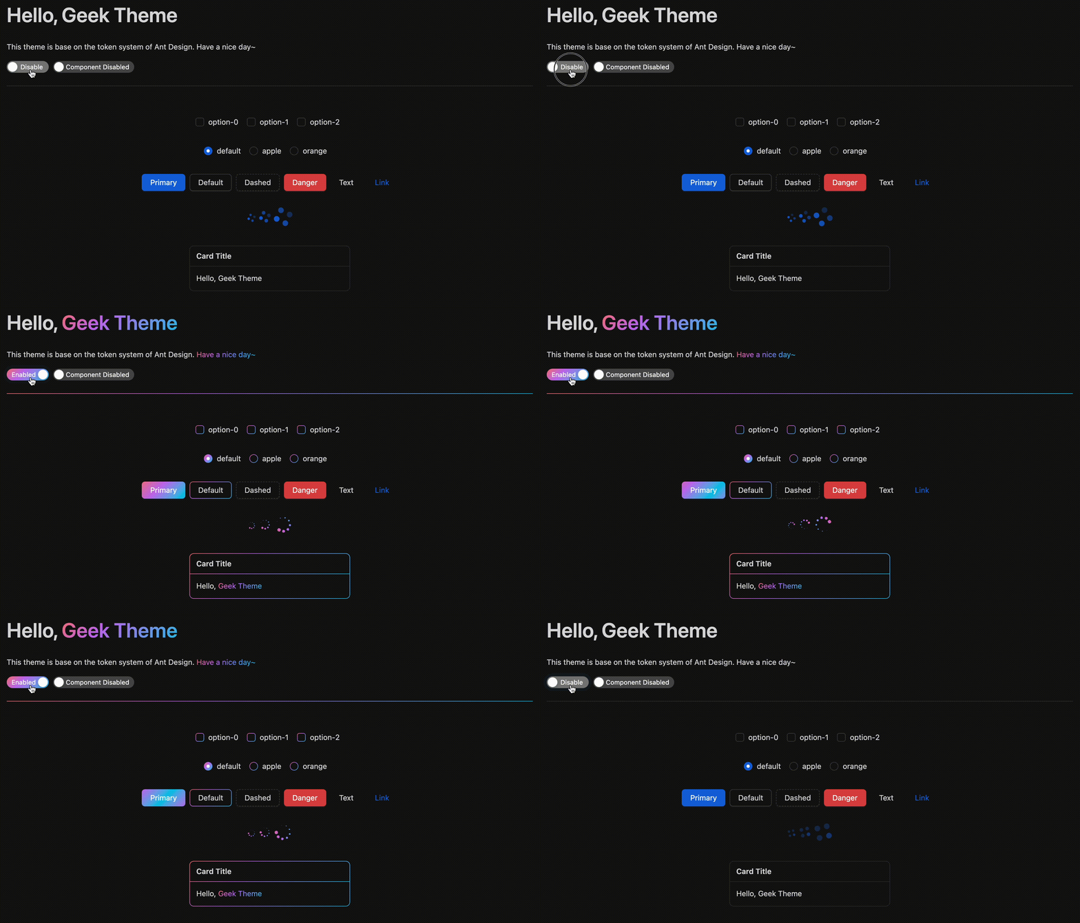
Sample code in styles/styleUtil copy the antd genComponentStyleHook function.
You can use any other css-in-js solution to generate style hook like Emotion or styled-components.
Use ThemeProvider to wrap your app.
import { ThemeProvider } from 'antd-geek-theme-sample';
import { Button, Space, Switch } from 'antd';
import React from 'react';

const desc = 'Hello World';

const App: React.FC = () => (
  <ThemeProvider>
    <Space>
      <Button type="primary">{desc}</Button>
      <Switch checkedChildren={desc} unCheckedChildren={desc} />
    </Space>
  </ThemeProvider>
);

export default App;Wrapper component will pass config with antd ConfigProvider.
npm install
npm start
npm test
npm run coverage
open coverage/ dir
antd-geek-theme-sample is under the MIT license.
