Google Analytics is presently one of the most popular digital analytics software. It can provide valuable insights that can help business shape their strategies to target more customers. Though like everything in the world of Data Science and Analytics, there is a tradeoff – a cost of $150k for customer level insights. Across industries, customer acquisition work in similar ways. This analysis would prove extremely useful in creating customized strategies for different customer segments. Forecasting the traction will help in systematic presentation of promotional offers, special packages etc.
This repository contains our Fall 2019 term project for MIS 281N Advanced Predictive Modeling as part of the MS Business Analytics curriculum at UT Austin.
Google Analytics has data available at vast combinations of metrics and dimensions. We were working for a client who was entering a new market and they were using their website to sell their products.
We cannot emphasize enough on the benefits that come with knowing this one number. Depending on the kind of business, it can help reduce uncertainties in different parts and answer pressing questions like “How much inventory should I keep?” or “How do I allocate my resources” — salesforce in our case. While in our case knowing the number of visitors on the website tomorrow may not help too much (since the website is already up and running and designed to handle moderate traffic), knowing the number of people who will “enroll” for the services in the future can help us forecast our demand (and many other things) which can answer a lot of important questions.
Once we know the forecast for the demand in the future, understanding what drives that demand can be highly valuable information, especially for a nascent company. GA tracks a myriad of attributes about the users — the channel they came through, their age, their gender, the device they are using, etc. Leveraging these attributes to set strategies proves to be highly beneficial.
Google provides you with you access to download everything you can see on your GA dashboard. But there is a catch! The granularity of the accessible data depends if you are a premium or a non-premium account holder. GA offers a premium membership that gives access to user-event level information and it comes with an annual fee of $150k to be paid to Google. But even with non-premium accounts, we have access to pretty much whatever we can see on the dashboard with a limited view. You can download individual files for subset of data but that is inefficient. We have used the Google API's to access our data. All one requires is a JSON file (from your website) and our ga_connect.py (from our git repository). These are the steps to follow -
- Create your key file — ‘client_secret.json’ for your website.
- This will help you connect to Google’s core reporting API.
- We have developed a data pipeline which establishes a connection to access GA data
Note - You need to have a Google Analytics service account linked to your website to initialize a json file.
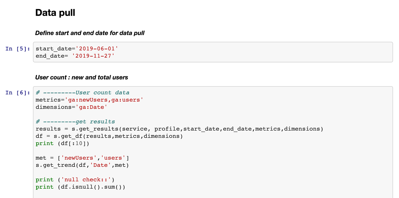
Please refer to ga_connect.py in the same folder as the Jupyter notebook. All you need to do is enter the time range, metrics, and dimensions, use the get_df function and directly import the downloaded data in a pandas data frame.
We focused on two main questions - Forecasting the conversions and analyze the customer attributes showing a higher lift of conversion.
We worked on creating a ‘self-learning time series forecasting model’ to predict enrollments in the future. The entire model is a pipeline of two separate models — a seasonal ARIMA model and a dynamic regression model that works on top of the seasonal ARIMA model to predict future enrollments. For web traffic data, there are high chances of observing seasonality (weekly, monthly, yearly, etc) in user flow and hence we decided to use the seasonal ARIMA model as the first step to forecasting. We built a ‘self-learning’ SARIMA model by auto-tuning the hyperparameters for a seasonal ARIMA model. The following piece of the code shows how a grid of hyperparameter can be defined using our code to configure the seasonal ARIMA model.
A seasonal ARIMA model consists of parameters that need to be configured correctly to capture the order, seasonality, and trend in the data. We included the plausible values for the 8 SARIMA parameters to be explored in the grid search and the code returns the best 3 models based on RMSE using a walk-forward validation approach.
For a time-series forecasting model, some variables are not directly dependent on the model but they do affect the model in one way or the other. For example — a website might attract more traffic on weekdays compared to the weekends. Similarly, a website might be reached more frequently during the start and the end days of the months — think of a website where payment needs to be made during the start of each month. In our dynamic regression model apart from the ‘best’ SARIMA model from the previous step we also included these ‘exogenous’ variables which can help better predict the user enrollment in the future.
The above code can be used to forecast any time series data. For SARIMA auto-tuning — define the grid and pass the time-series to be forecasted in the form of a pandas series object. The list of exogenous variables can be altered based on the context in which forecasting is performed.
As mentioned before, Google Analytics tracks a myriad of attributes about the users — the channel they came through, their age, their gender, the device they are using, etc. We use these dimensions to estimate the effectiveness of different user attributes — to answer questions like “are more females subscribing or more males?” or “which marketing campaign is driving more conversions?”, or more broadly “what’s working for us? what does our typical customer look like?”. If we can answer these questions, we can try to target ‘lookalike’ leads who might be more likely to sign up and hence make our marketing efforts more effective. To estimate the importance of these dimensions, we built a model where our response variable was a derived metric — ‘Pass-Through Rate’ (PTR) and we used the number of ‘Good Sessions’ split by different dimensions on a particular day as the regressors (Refer to Audience tab of your GA dashboard)— this was the maximum level of granularity we could achieve with the free version of GA.A few defined metrics which we focused on are -
• Pass Through Rate (PTR) - Percentage of signups that got completed on a given day.
• Good sessions - Count of sessions that didn’t bounce off Good sessions = session_count * (1 — bounce rate) at a daily level for every dimension
Note - Google Analytics defines a bouncy session where the user didn’t interact at all with the website Bounce rate = bouncy sessions/total sessions for a given day. For a more thorough understanding, refer to our Jupyter notebook().
Our modelling approach was as follows -
Step 1. Built separate models for each dimension with PTR as the target variable, used LASSO regularization for feature selection to reduce the number of regressors (Refer Audience Tab on GA dashboard))
Why run Lasso - LASSO by virtue of its interpretability and shrinkage properties, helps in deciding the features that are significantly affecting the response variable vs the non-significant ones by driving the betas for non-important variables to 0. Running LASSO on the individual dimension level models helped us get a list of the metrics that are significant by themselves for explaining our PTR.
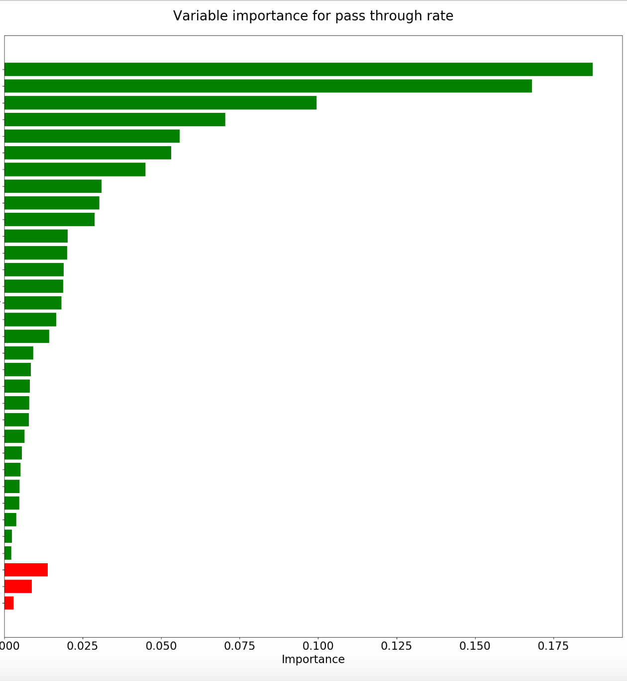
Step 2. Focusing on important features across dimensions by aggregating everything in one model. Since we were focusing on feature importance in an interactive space, we used the Random Forest regressor. Our metrics were a day level summary of web traffic, therefore we accounted for the autocorrelation in the data separately by treating PTR for the effect of lag before reporting the variable importance.
This simple analysis can help a website owner achieve actionable insights. Through this modeling, business insights can be drawn very easily. We can see that good sessions that came through the AT&T network, from Apple devices, via any TV/radio/print media marketing campaign or the digital social Facebook campaign were most positively impacting our PTR, while visitors from age group 35–44 are significantly affecting our PTR negatively. Through these insights, we can further align our marketing efforts to boost what is beneficial and correct what isn't working.
This was one of our biggest challenges in this project. Since our company set up their website in June, we had only five months of data to work with, not enough for a good time series model. That was our motivation for building a self-learning time series model, which will provide results with higher accuracy as the amount of training data increases.
Please refer to our medium article to get a comprehensive outlook of our project.


