Dear Future developer,
We are building a product that brings consumers and brands closer together. See it as a kind of "social network".
We are delighted to enlist your help in building one of its cool UI feature.
Expected Time: 3-5 hours total time. ⌛ (This is not a strict limit: you can spend as much or as little as you want.)
-
We understand a take home test is a big investment in terms of time, but that will give you the opportunity to see the kind of stuff we do here. If you enjoy building the feature, you'll have a great time working with us!
-
Quality matters more than quantity!
It does not matter whether you finish or not, what we're mainly interested in, is:
- Your approach to tackle UI challenges like this one
- How you organize and structure your code?
- How do you make it easy to read, extend, and maintain in the long term?
- The quality you can deliver in a limited amount of time
- The code you submit should be as close as possible to be ready for a release on production. So imagine it is going to be reviewed by developers and tested by QA for an imminent release.
-
This tech challenge must be done in ReactJS/Typescript. You can use
styledor widgets library like@mui, semantic...for the styling. Apart from that you shouldn't need any extra library to build the features we request. However, if you include any, please add some notes to explain why. -
We don't expect the UI to be 100% pixel perfect with the time constraint, but still we expect a certain level of quality. That means for example, no component out of place, missing margins, ui glitched ... Build something that you would appreciate using everyday.
-
Please, don't forget to tell us the amount of time you dedicated to this exercise, and what you would have done if you had more time.
-
To make it easy to review, please push your code to a repo in github and create a PR for each feature your take on. Then you can add us as reviewer.
-
If anything is unclear, don't hesitate to reach out.
A back end is already set up on port 4000, but you're gonna have to do some work there...
The back-end contains a list of feed and comments in the directory /server/data, which simulates the DB.
There, you'll have to write different endpoints:
-
An endpoint to return the list of feed with
PAGE_SIZE=5. This endpoint should basically return (0-5, 5-10,...) based on the scrolling position. -
An endpoint to return the list of comments by
briefref
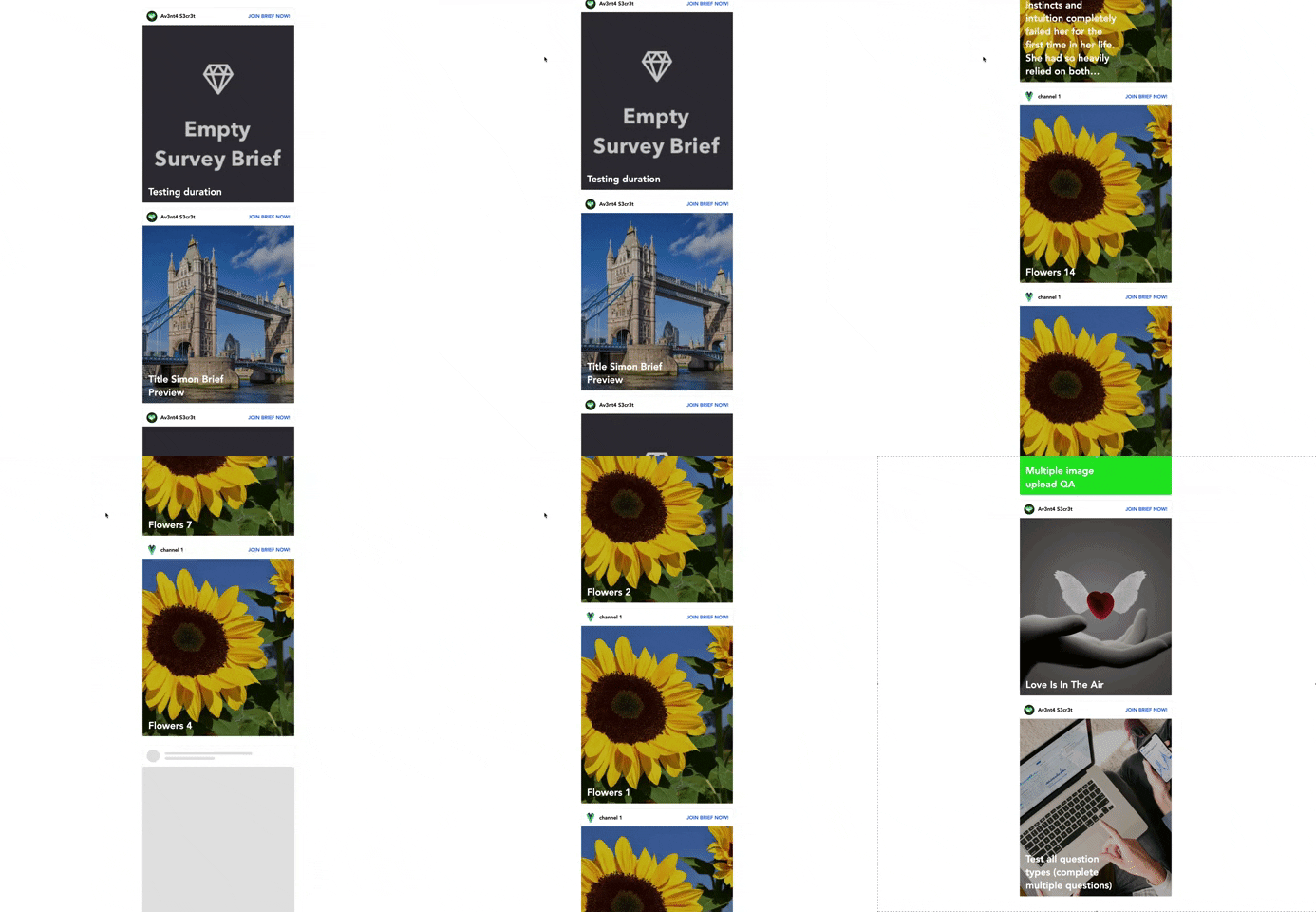
A feed is composed of:
- Header (brand, brand name, and a link
Join Brief Now) - Image (banner_image)
- A feed title (feed_title)
Requirements:
- Display elements on the UI as seen in the demo.
- Each feed should be horizontally centred, with some margin between each feed.
- The brand logo and the name should be left aligned, while the link
Join this briefshould be right aligned. - The feed title should be displayed at the bottom left, on top of the image.
- Maintain aspect ratio of the image on different breakpoints.
- At first load, it should only load the first 5 feed, then when scrolling to the bottom, it should fetch the next 5.
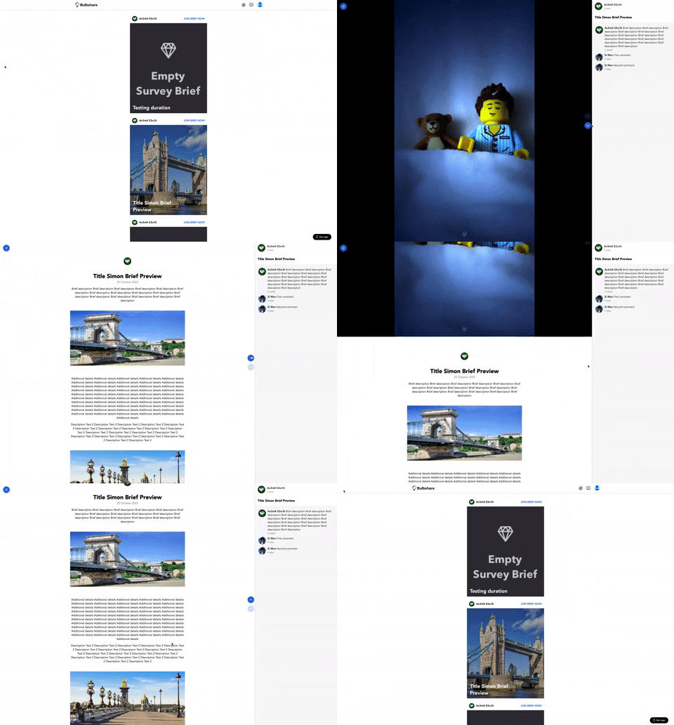
When clicking on a feed image, a fullscreen div should show up, on top of the list of feed.
Requirements:
- Show a popup fullscreen on top of the feed.
- Add a close button on the left side to close the modal.
That div is composed of 2 parts:
Requirements:
- A div of 100% height which allows to scroll on multiple items. At all times, only one item should be visible and take the whole height available, except obviously when you switch between items (click on up/down).
In this case, you can scroll through 2 items:
Requirements:
- The
banner_imageshould be centered horizontally. - The
banner_imageshould take 55% of the available space. - We should have a black background behind the image.
- The Up Arrow should be disabled on first item and down arrow disabled on last item.
Requirements:
A div (100% height) whose content should be horizontally centred, and stacks the following properties:
- brand
logoat the top. feed_title.starts_ondate with the following format (DD MMMM YYYY).- Text
banner_text. - Image
ad_1_image. - Image
ad_2_image.
We want to be able to scroll through items in 2 ways:
- Clicking on Up/Down arrows. Buttons should be always horizontally/vertically centred.
- On mouse scroll up/down. Obviously that should not prevent you from scrolling normally within an item whose content's heigh exceed the current window height.
The right part is a div which takes also 100% height, and does not move as opposed to the left part. Its width is static and set to 500px.
Requirements:
- At the top it should display brand logo and name.
- On a grey background, it should display the list of comments.
A comment is composed of:
- avatar
- name
- comment
In the /public folder, you'll find 2 svgs you can use in your code:
- The closing of the fullscreen modal.
- Up/down arrows for scrolling through items.

