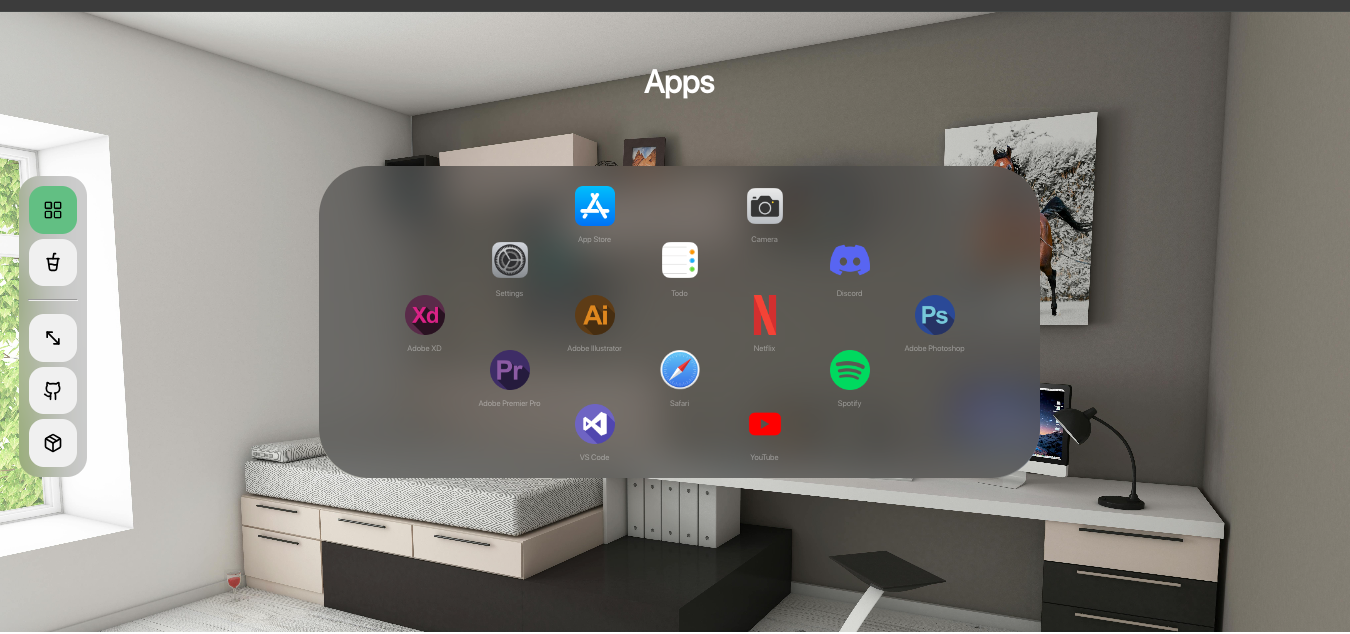
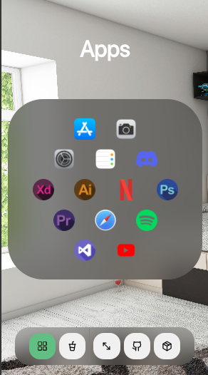
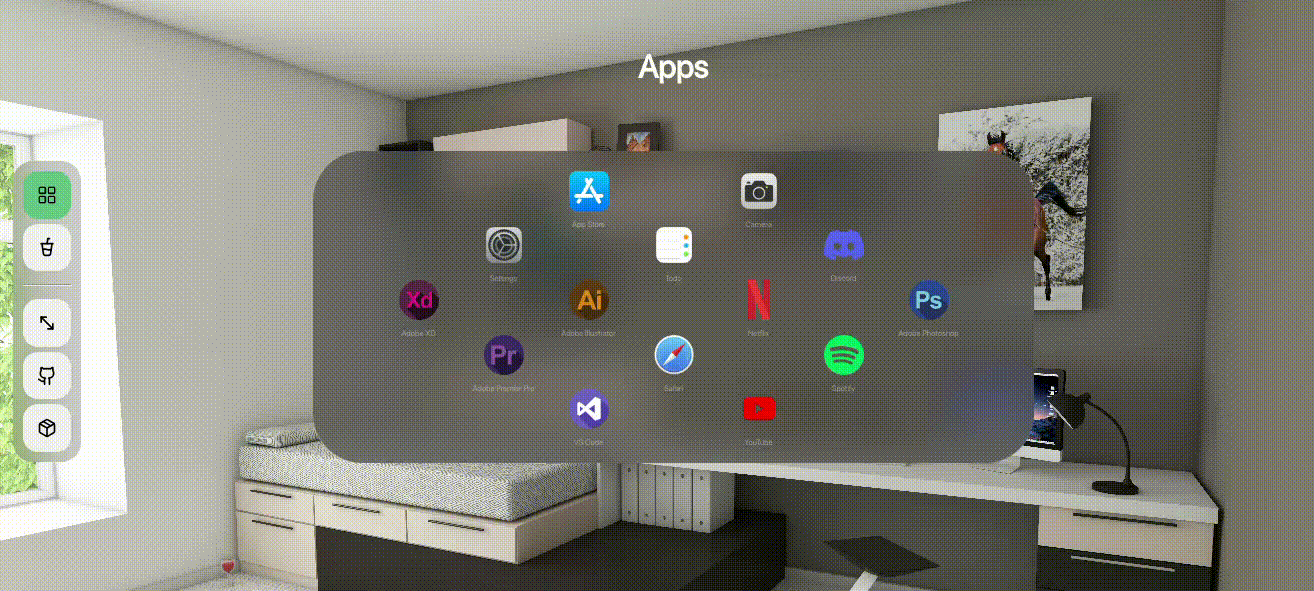
Uniform icons spread animation, accompanied by a glassy and bouncy effect. Similar to Apply Vision Pro home view, perfect for any application.
Install thedock with npm
npm i thedockimport Thedock from 'thedock';
function App() {
const [percentage, setpercentage] = useState(0)
return ( <>
<Thedock
icons={icons}
ar={'1/2'}
iconWidth={40}
containerWidth={'80vw'}
percentage={percentage}
setpercentage={setpercentage}
maxBoxes={5}
startingPosition={'middle-center'}
showText={true}
texts={texts}
marginForText={8}
iconstyles={{cursor: 'pointer'}}
onclickHandler={(index, src, text)=>(alert(index))}
/>
<button onClick={()=>(setpercentage(1.1))}></button>
</>)
}| Parameter | Type | Description |
|---|---|---|
icons |
Array: [src1, src2...] |
Required: the array with the sources of all icons |
ar |
string |
Required: aspect-ratio of the icon displayed in the format: x/y |
iconWidth |
number OR 'auto' |
Required: the maximum width an icon can reach: if set to auto, icon will grow as the containerWidth increases without any limit. If set to a number, the icon will stop growing above the iconWidth |
containerWidth |
CSS style property |
Required: the width of the main container in CSS format, example: '40vw' |
percentage |
number |
Required: a number between 0 and 1, the percentage of the path completed by all icons, 1 means they are at the final position. |
setpercentage |
(percentage) => void |
Required: function to change the percentage, required to show the bouncy effect |
maxBoxes |
number |
Required if configuration not provided: the maximum number of icons in a row, ONLY FUNCTIONAL WHEN configuration is not provided, is required to do auto-configuration of icons. |
texts |
Array: [text1, text2...] |
Required if showText enabled: the text for each icon, should sum to icons length |
configuration |
Array: [2, 3, 4...] |
number of icons in each row, should sum to the number of icons in the icons array. |
textstyles |
object |
styles for the text if showText enabled |
marginForText |
number |
a margin for text below an icon, defaults to 0 if showText disabled |
showText |
boolean |
show the text below icons, dpecified in the texts array |
style |
object |
the custom styles for the container of icons |
iconstyles |
object |
the styling applied to each icon |
startingPosition |
string |
the inital position of all icons from where they start moving: top-left / top-center / top-right / middle-left / middle-center / middle-right / bottom-left / bottom-center / bottom-right |
onclickHandler |
(index, src, text) => void |
a function called whenever an icon is clicked |