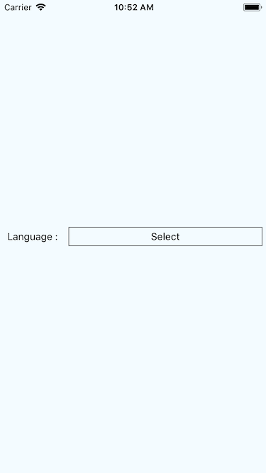
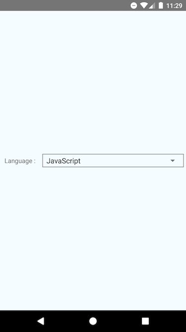
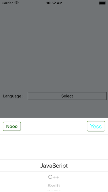
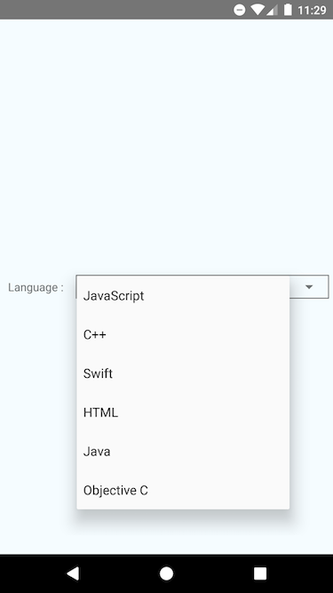
Custom React-Native picker component for iOS and Android.
This component uses React-Native's default picker component. Additionally, it displays an overlay, animates the picker view and provide confirm and cancel options in iOS.
In Android, it provides a simple dropdown menu with different customization options.
Supports separate customizations for iOS and Android. For customization options please refer usage section.
- Requires
React-Nativev.0.54.0or greater. - Tested on
v.0.54.0 - Should work on lower versions as well.
Installation can be done via npm or yarn.
npm i ihakpicker --saveyarn add ihakpickerimport IHAKPicker from "ihakpicker";<IHAKPicker
placeholder={"Select"}
confirmButtonTitle="Yess"
cancelButtonTitle="Nooo"
androidPickerMode="dialog"
androidDialogPrompt="Select"
pickerTitle={this.state.pickerTitle}
data={this.data}
selectedItem={this.state.selectedItem}
onPressConfirm={this._iHAKPickerOnPressConfirm}
onPressCancel={this._iHAKPickerOnPressCancel}
customStyles={{
container: {
borderWidth: 1,
borderColor: "#666",
margin: 5
},
placeholderText: {},
titleText: {},
confirmButtonText: {
color: "#0FF",
fontSize: 20
},
cancelButtonText: {
color: "#378324",
fontWeight: "bold"
},
confirmButton: {
borderWidth: 1,
borderRadius: 5,
borderColor: "#458908"
},
cancelButton: {
borderWidth: 1,
borderRadius: 5,
borderColor: "#458908"
}
}}
/>For further implementational details see example implementation in App.js. Also check default props and style object in
ihakpicker.js.
| iOS | Android |
|---|---|
 |
 |
 |
 |
MIT.
Hassan Ahmed Khan [email protected]