mpldatacursor provides interactive "data cursors" (clickable annotation
boxes) for matplotlib.
mpldatacursor offers a few different styles of interaction through the
datacursor function.
As an example, this displays the x, y coordinates of the selected artist in an annotation box:
import matplotlib.pyplot as plt
import numpy as np
from mpldatacursor import datacursor

data = np.outer(range(10), range(1, 5))

fig, ax = plt.subplots()
lines = ax.plot(data)
ax.set_title('Click somewhere on a line')

datacursor(lines)

plt.show()

If no artist or sequence of artists is specified, all manually plotted artists
in all axes in all figures will be activated. (This can be limited to only
certain axes by passing in an axes object or a sequence of axes to the axes
kwarg.)
As an example (the output is identical to the first example):
import matplotlib.pyplot as plt
import numpy as np
from mpldatacursor import datacursor

data = np.outer(range(10), range(1, 5))

plt.plot(data)
plt.title('Click somewhere on a line')

datacursor()

plt.show()
To hide a specific annotation box, right-click on it (Customizable through the
hide_button kwarg). To hide all annotation boxes, press "d" on the
keyboard. (Think of "delete". "h" was taken by matplotlib's default key for
"home".) Hitting "d" again will re-display all of the datacursors that were
hidde. To disable or re-enable interactive datacursors, press "t" (for
"toggle"). Pressing "t" will prevent clicks from creating datacursors until
"t" is pressed again. <shift> + <right arrow> and <shift> + <left
arrow> will move the datacursor to the next or previous item in the sequence
for artists that support it. At present, this is more-or-less limited to
artists created with plot and scatter. These keys can be customized
through the keybindings kwarg.
The displayed text can be controlled either by using the formatter kwarg,
which expects a function that accepts an arbitrary sequence of kwargs and
returns the string to be displayed. Often, it's convenient to pass in the
format method of a template string (e.g.
formatter="longitude:{x:.2f}\nlatitude{y:.2f}".format).
As an example of using the formatter kwarg to display only the label of the
artist instead of the x, y coordinates:
import numpy as np
import matplotlib.pyplot as plt
from mpldatacursor import datacursor

x = np.linspace(0, 10, 100)

fig, ax = plt.subplots()
ax.set_title('Click on a line to display its label')

# Plot a series of lines with increasing slopes...
for i in range(1, 20):
    ax.plot(x, i * x, label='$y = {}x$'.format(i))

# Use a DataCursor to interactively display the label for a selected line...
datacursor(formatter='{label}'.format)

plt.show()

datacursor will also display the array value at the selected point in an
image. This example also demonstrates using the display="single" option to
display only one data cursor instead of one-per-axes.:
import matplotlib.pyplot as plt
import numpy as np
from mpldatacursor import datacursor

data = np.arange(100).reshape((10,10))

fig, axes = plt.subplots(ncols=2)
axes[0].imshow(data, interpolation='nearest', origin='lower')
axes[1].imshow(data, interpolation='nearest', origin='upper',
                     extent=[200, 300, 400, 500])
datacursor(display='single')

fig.suptitle('Click anywhere on the image')

plt.show()

If draggable=True is specified, the annotation box can be interactively
dragged to a new position after creation.
As an example (This also demonstrates using the display='multiple' kwarg):
import matplotlib.pyplot as plt
import numpy as np
from mpldatacursor import datacursor

data = np.outer(range(10), range(1, 5))

fig, ax = plt.subplots()
ax.set_title('Try dragging the annotation boxes')
ax.plot(data)

datacursor(display='multiple', draggable=True)

plt.show()

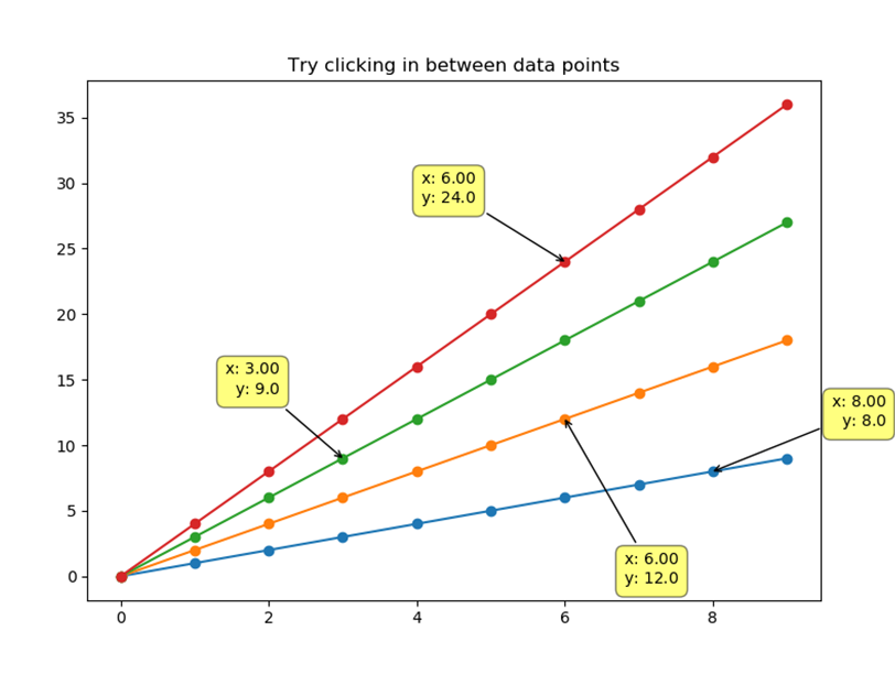
If magnetic=True is specified, the annotations will only appear on actual data points and not the interpolated lines connecting them. This works with Line Charts and other artists which has x and y attributes. For other artists, magnetic has no effect.
As an example (This also demonstrates using the display='multiple' and draggable='True' kwarg):
import matplotlib.pyplot as plt
import numpy as np
from mpldatacursor import datacursor

data = np.outer(range(10), range(1, 5))

fig, ax = plt.subplots()
ax.set_title('Try clicking in between data points')
ax.plot(data, 'o-')

datacursor(display='multiple', draggable=True, magnetic=True)

plt.show()

Additional keyword arguments to datacursor are passed on to annotate.
This allows one to control the appearance and location of the "popup box",
arrow, etc. Note that properties passed in for the bbox and arrowprops
kwargs will be merged with the default style. Therefore, specifying things
like bbox=dict(alpha=1) will yield an opaque, yellow, rounded box, instead
of matplotlib's default blue, square box. As a basic example:
import matplotlib.pyplot as plt
import numpy as np
from mpldatacursor import datacursor

fig, axes = plt.subplots(ncols=2)

left_artist = axes[0].plot(range(11))
axes[0].set(title='No box, different position', aspect=1.0)

right_artist = axes[1].imshow(np.arange(100).reshape(10,10))
axes[1].set(title='Fancy white background')

# Make the text pop up "underneath" the line and remove the box...
dc1 = datacursor(left_artist, xytext=(15, -15), bbox=None)

# Make the box have a white background with a fancier connecting arrow
dc2 = datacursor(right_artist, bbox=dict(fc='white'),
                 arrowprops=dict(arrowstyle='simple', fc='white', alpha=0.5))

plt.show()

HighlightingDataCursor highlights a Line2D artist in addition to
displaying the selected coordinates.:
import numpy as np
import matplotlib.pyplot as plt
from mpldatacursor import HighlightingDataCursor

x = np.linspace(0, 10, 100)

fig, ax = plt.subplots()

# Plot a series of lines with increasing slopes...
lines = []
for i in range(1, 20):
    line, = ax.plot(x, i * x, label='$y = {}x$'.format(i))
    lines.append(line)

HighlightingDataCursor(lines)

plt.show()

mpldatacursor can be installed from PyPi using
easy_install/pip/etc. (e.g. pip install mpldatacursor) or you may
download the source and install it directly with python setup.py install.